
Visual appeal is critical in drawing clients and leaving a lasting impression in the food industry. This is especially true in ice cream stores, where the sweetness of the treat extends not just to its taste but also to the aesthetics that surround it. crafting an engaging graphic design for your ice cream shop is analogous to crafting a tasty masterpiece; it needs a combination of creativity, smart thought, and an awareness of what attracts your target audience.
To effectively start with ice cream shop graphic design, you should begin by incorporating vibrant colors, playful typography, and mouthwatering visuals, such as images of tempting ice cream treats. Also, focus on maintaining a cohesive theme and implementing clear signage to captivate customers.
This article explores the subtle relationship between design and taste, delving into the factors that comprise great graphic design for ice cream stores. Prepare to learn the secrets of creating visually appealing aesthetics that not only capture the eyes but also enchant the taste senses, leaving an indelible impression on everyone who enters this sweet refuge.
Embracing Visual Delight: The Power of Vibrant Colors
Colors have the amazing and intrinsic capacity to evoke feelings and create the mood for any given event. This phenomenon is especially evident in the world of ice cream stores, where the use of vivid and exuberant colors stands out as a powerful tactic. These hues effortlessly evoke delight and inspire pleasant feelings in customers by resonating with the very essence of the ice cream experience.
A creative technique that replicates the variety of flavors and kinds available in an ice cream parlor is the use of a well-chosen selection of colors. This strategy cleverly creates a visual link between the mouthwatering offerings and the overall company identity. Each hue can heighten the sense of delight that customers associate with the establishment by evoking a subtle yet powerful emotional connection when it is carefully chosen.
The environment exudes a whimsical and childlike vibe because of the use of soft pink and blue hues that are reminiscent of cotton candy and blueberry swirls. These tones bring back feelings of innocence and nostalgia, bringing to mind happy times spent enjoying ice delicacies on warm afternoons. Warm complementary yellows evoke the rich, creamy flavor of butter pecan and custard-based treats, establishing a welcoming and cozy atmosphere that entices guests to indulge.
Indulgent browns, like the rich shades of chocolate and caramel mixtures, can evoke thoughts of luxury and contentment. This beautiful blending of hues tells a story about the indulgence contained in each scoop of ice cream. As a result, the chosen color scheme acts as a silent but powerful narrator, teasing the audience with the promise of an exceptional and pleasant experience that awaits them inside the ice cream shop.
The influence of colors on our psychology cannot be overstated. According to research, various colors have the power to arouse particular emotions and increase desire. Utilizing this understanding, operators of ice cream parlors can use color strategically to improve the general sensory experience of their patrons. These companies can increase the emotional resonance that people identify with their brand by skillfully combining colors that reflect the variety of tastes they offer.
Typography that Dances: Playful Fonts Speak Volumes

Typography, frequently lauded as the very language of design, emerges as a crucial tool for expressing the unique personality of your ice cream shop. Similar to how the smooth texture of your ice cream dances on the palate, your customer’s eyes will be enchanted by the choice of playful and vibrant fonts. Taste and sight combine in a seamless symphony to create an all-encompassing experience.
Fonts function as the conductor of an orchestra in the visual identity of your ice cream shop. Similar to how a conductor directs an ensemble to express a certain mood via music, fonts direct the visual story you want to tell. The selection of fonts is comparable to the selection of musical notes since each letterform conveys a unique atmosphere and generates a particular emotion. Fonts can act as a precursor to the mouthwatering symphony of flavors that guests are about to indulge in as they enter the establishment.
Think about fonts that evoke fond memories of childhood or the joy of a carefree summer day. These fonts have an aura of familiarity and warmth about them like handwritten notes swapped between friends or the swirling letters on old ice cream parlor signs. These fonts evoke a feeling of comfort and joy in your customers, much like the first bite of ice cream does.
The fonts you’ve picked can emphasize the playful nature of your brand just by their sheer shapes. The soft serve’s swirly twirls are mirrored in playful loops and fanciful strokes, and the ice cream being scooped is gracefully cascaded in flowing curves. Every letterform acts as a brushstroke in the masterpiece that is your visual identity, adding to the overall impression that your brand leaves on your target audience.
Harmony, however, is crucial in this typographic symphony. Your message must be effectively balanced between readability and creative expression if you want it to be understood. Too elaborate a font may be physically appealing but challenging to read, detracting from the message that is trying to be conveyed. On the other hand, a font that forgoes originality in favor of simplicity can fall short of capturing the playful vibe of your ice cream shop.
A Visual Feast: Tempting Treats in High Definition
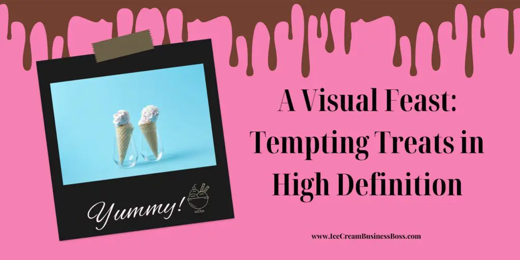
In the realm of ice cream, the proverb “a picture is worth a thousand words” acquires a delectable new meaning. Here, a picture can elicit both a thousand words and a thousand cravings. The clever insertion of gorgeous, enticing pictures of your ice cream products acts as a visual stroke of genius that goes beyond simple aesthetics to transport customers on a sensual adventure.
Imagine a close-up photo that perfectly depicts the flavor of your ice cream: a scoop softly dripping in all its delicious glory, gleaming with creamy perfection. The sweetness and coolness are nearly detectable to the viewer’s tongue. An almost tangible anticipation for the experience is created by the image’s vibrant colors and rich textures, which instantly connect the visual and gustatory senses.
The appeal extends beyond the ice cream itself. Images of toppings expertly arranged in cascading splendor provide a touch of opulence and elegance. The quiet clinking of toppings landing on the scoop can almost be heard in the viewer’s head, creating a symphony of flavors. These photos don’t just show food; they also show the creativity and skill that go into each creation.
In this visual story, textures are crucial. An immersive experience is produced by a macro image that closes in on the velvety surface of a scoop or the minute intricacies of a waffle cone’s texture. Such is the force of a well-captured image that the viewer may reach out to touch the screen out of instinct. Customers are prepared for the multisensory delight they will soon experience thanks to the tactile connection that has been formed through sight.
These pictures act as a mouthwatering invitation, luring clients to your store even before they set foot inside. The mental image of eating a scoop of ice cream brings to mind the initial chill, the explosion of flavors, and the delicious messiness that comes with the ice cream experience. These pictures are more than just pretty pictures; they’re entryways to virtual experiences that whet the appetite for the real thing.
A well-crafted image offers great potential in the social media era. Your ice cream business can become an Instagram-worthy refuge with the help of a visually appealing image. Through social media platforms, visual attractiveness spreads its tendrils, sparking discussions and encouraging potential customers to visit for a taste of the actual thing. Sharing these photographs turns into a form of word-of-mouth advertising where the image itself communicates a message that is often difficult for words to do.
Weaving the Threads: The Importance of Cohesive Themes

All of the graphic design components of your ice cream business are flawlessly woven together by a unifying theme, acting as the guiding thread that creates a tapestry of harmony and a fascinating narrative. It serves as the glue that holds the visual elements together to form a memorable and powerful brand image that sticks in clients’ minds long after they have left your business. This theme, which has been thoughtfully developed, serves as the visual language through which your brand speaks to the outside world.
Consider your ice cream business as a blank canvas ready for painting with a variety of hues, forms, and textures. The color scheme for your retail displays, packaging, menus, and digital platforms will be determined by the theme you select. Each design element within your selected theme contributes to the overall impression your shop presents, just as each brushstroke contributes to the finished work of art.
Consistency is the key. The theme must flow naturally from the minute a customer sees your storefront to the moment they open their ice cream and even when they come across your brand on social media. Customers may quickly identify and relate to your brand thanks to this unity’s sense of familiarity and trust. The theme becomes the face of your ice cream store, a face that consumers get to know and love. It’s like spotting a familiar face in a crowd.
The theme also reflects the character, principles, and products of your ice cream shop. The theme becomes a mirror that reflects what your brand stands for, whether you’ve chosen a retro-inspired parlor reminiscent of vintage soda fountains, a modern and sleek aesthetic that speaks of innovation, or a fantastical wonderland that appeals to the child in all of us. It arouses feelings and establishes expectations, and when skillfully carried out, it becomes a crucial component of the entire client experience.
A thorough understanding of your target audience is necessary for selecting the appropriate theme. It’s important to consider how your business might appeal to potential clients as well as yourself as the owner. Are they looking for sophistication, nostalgia, or a feeling of play? Your theme should be a direct reaction to these desires, producing a welcoming and captivating aesthetic environment.
Learn the most common soft-serve ice cream shop designs by visiting this article here.
Guiding the Way: The Clarity of Clear Signage
Clear and alluring signage shines as a beacon in the colorful tapestry of the world outside the windows of your ice cream business, inviting people to enter your refuge of delight. The effectiveness of these signs goes beyond their aesthetic appeal in the field of ice cream shop graphic design; rather, they operate as useful road signals that lead customers from curiosity to satisfaction. Since beauty and practicality are combined, graphic design in this setting is more than just an exercise in aesthetics.
Think of your signage as the inviting glow that pierces the busy streetscape and piques people’s interest. These signs provide a purpose that goes beyond simply aesthetics; they serve as navigational aids that make sure your consumers have a smooth experience. These visual signals compose a symphony of simplicity and convenience, whether it be the alluring menu boards that display your delectable choices or the directional signage that directs customers to their intended location within your shop.
Clarity is crucial. Even from a distance, a well-designed sign should be simple to read. Customers should be able to quickly gather information without having to squint or comprehend complex symbols thanks to readable typography. Each phrase should be carefully picked to effectively capture the core of your products. This clarity avoids the confusion that can result from ambiguity and fosters confidence in the competence of your business.
Another key aspect is strategic placement. Similar to how a lighthouse directs ships safely to land, your signage should direct customers to the experiences they want to have. For example, menu boards should be positioned such that customers can readily see them, saving them from neck-craning gymnastics. Putting directional signs in the right places will help visitors move through your store more easily and improve their experience overall.
Your signage must blend well with the overall visual identity of your ice cream shop. The typefaces, colors, and design components should flawlessly complement the chosen theme, enhancing the perception of your company. Consistency is a great tool that helps clients remember your brand and is not just aesthetically pleasing.
Think of your signage as an extension of the voice of your company. The individuality of your shop is communicated through the texture and flavor of your ice cream, and it is also communicated through your signs. Customers feel empowered and satisfied when they can make decisions with ease because of clear and concise communication.
Frequently Asked Questions
Why is incorporating vibrant colors important in ice cream shop graphic design?
Brilliant colors elicit positive emotions and correspond to the joyous experience of eating ice cream. They make an immediate visual connection, drawing clients and improving your shop’s overall appeal. You may communicate the essence of your business and offers by employing a coordinated color palette.
How does cohesive theming affect the graphic design of an ice cream shop?
Cohesive theming integrates your ice cream shop’s visual elements, from décor to packaging and internet presence. It helps to strengthen your brand’s identity, making it more memorable and recognized by buyers. Whether your theme is old, modern, or whimsical, design consistency produces a distinct and appealing ambiance that appeals to your target audience.
How important is clear signage in good ice cream shop graphic design?
Clear signage is critical for directing customers and improving their experience. Well-designed signage, such as menu boards and directional signs, assists customers in easily navigating your store and making informed decisions. It also adds to the professionalism of your brand and produces a seamless link between your graphics and actual customer needs.
The information provided by IceCreamBusinessBoss.com (“The Site”) is for general informational purposes only. All information on the Site is provided in good faith, however, we make no representation or warranty of any kind, express or implied, regarding the accuracy, adequacy, validity, reliability, availability, or completeness of any information on the Site. Under no circumstance shall we have any liability to you for any loss or damage of any kind incurred as a result of the use of the Site or Reliance on any information provided on the Site. Your use of the Site and your reliance on any information on the Site is solely at your own risk. This blog post is for educational purposes only and does not constitute legal advice. Please consult a legal expert to address your specific needs. Terms and Conditions.

Hi! I am Shawn and I am a happy individual who happens to be an entrepreneur. I have owned several types of businesses in my life from a coffee shop to an import and export business to an online review business plus a few more and now I create online ice cream/gelato business resources for those interested in starting new ventures. It’s demanding work but I love it. I do it for those passionate about their business and their goals. That’s why when I meet a ice cream/gelato business owner, I see myself. I know how hard the struggle is to retain clients, find good employees and keep the business growing all while trying to stay competitive.
That’s why I created Ice Cream Business Boss: I want to help ice cream and gelato business owners like you build a thriving business that brings you endless joy and supports your ideal lifestyle.